Currently, following types of dashboard parts are supported. New types can be implemented, if desired (see Developing DashboardParts).
Text-based
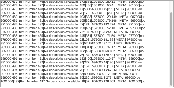
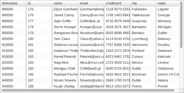
Table
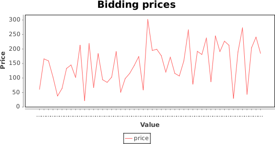
Lines
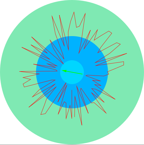
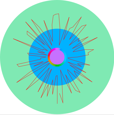
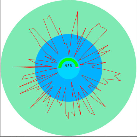
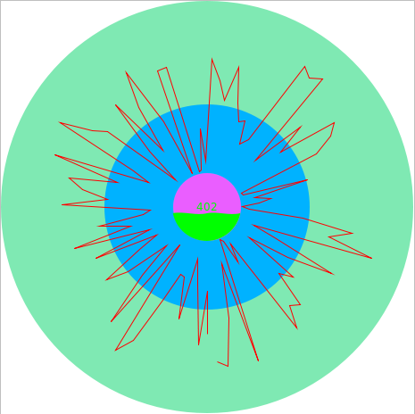
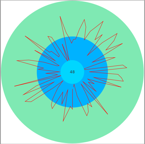
Wheel
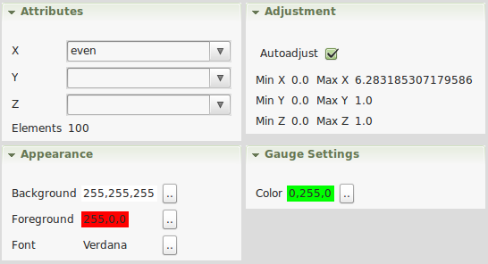
The wheel chart transforms the selected attribute value into circle coordinates and plots them on a wheel.If the autoadjust setting is enabled, the value will be normalized to 360 degree. In addition you can set the fore- and background of the chart.
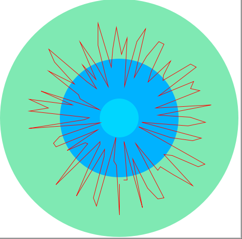
In addition to the basic wheel, you can select combined dashboard parts with arrow, color, gauge, liquid gauge, and text to display additional information.
Settings
Depending on the selected wheel chart, you can select the used attributes, adjustment, and appearance of the chart.
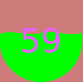
Liquid Gauge
The liquid gauge displays the current value as a liquid indicating the current value in the center.
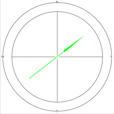
Compass
The compass chart draws the current value of an attribute as a cardinal direction by normalizing the value between 0 and 360 degree.
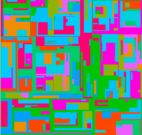
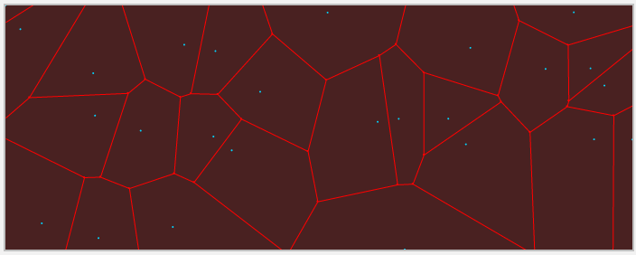
Voronoi
Visual partitioning using a Voronoi diagram.
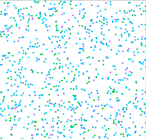
Color Chart
Visualisation of spatial measurements using different colors.
Quad Tree
Visual partition of spatial measurements using a Quad Tree.