Odysseus Studio has some build-in charts that can be used to visualize the output of a query.
To create these diagramms, go to the Query View and do a right click on the query, for which the results should be presented. Choose "Show Chart".
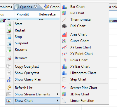
There are different kinds of diagramms.Chose e.g. XY Line Chart.
A new windows is opened (and if the query is running is filled with input). The following example is from nexmark:auction.
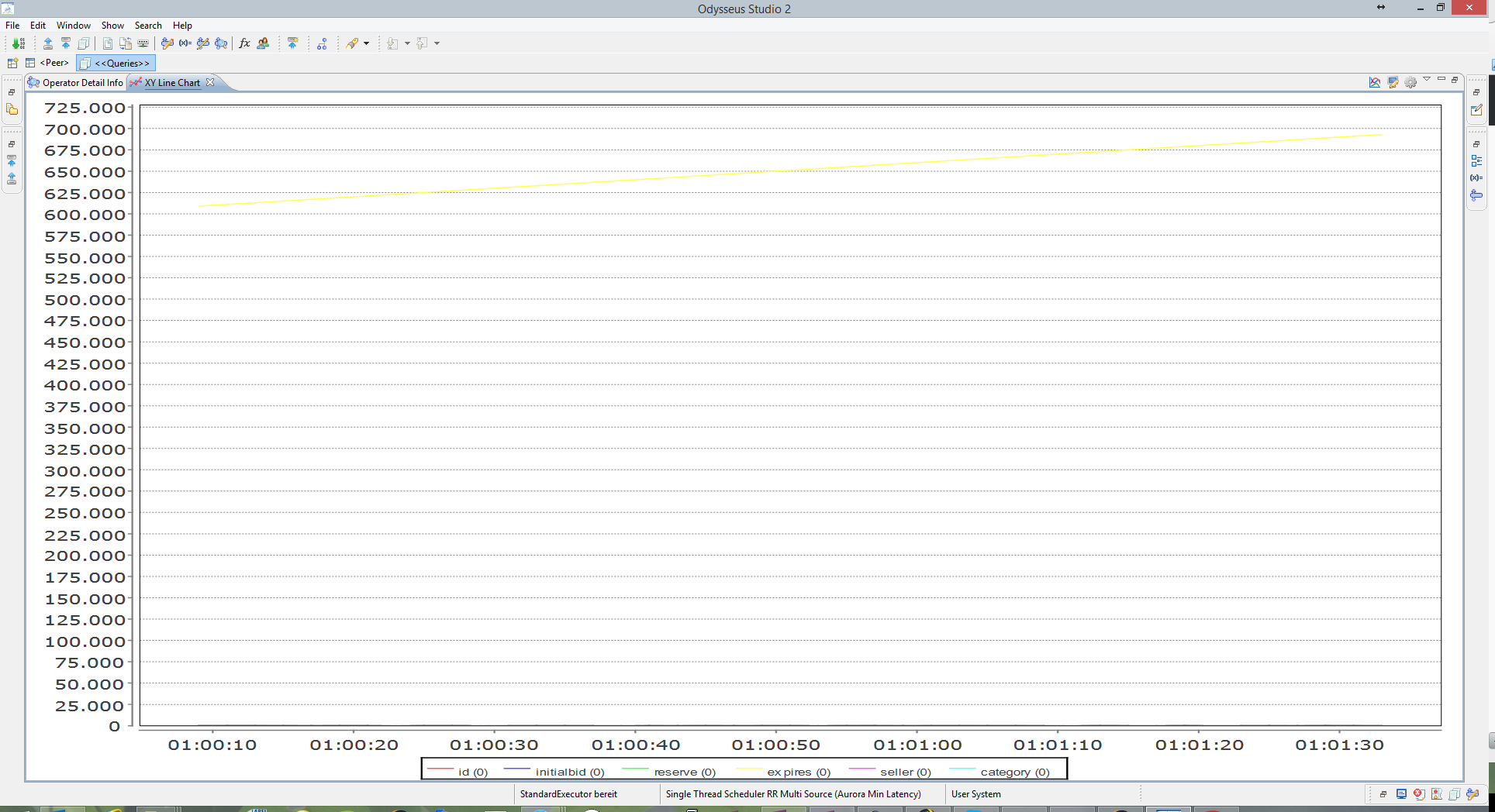
As you can see, all numeric values are per default selected in the graph, which is not very helpful in this scenario.
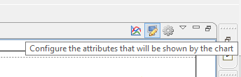
To select a subset of attributes select the button in the upper right area of the window:
And the following window appears:
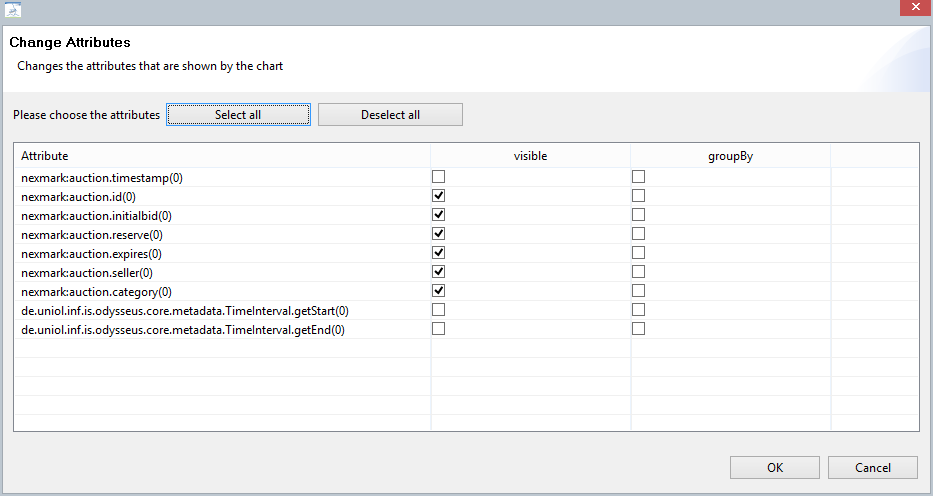
On the left side you see all attributes that are available for selection and on the right side visible and groupBy marker. Visible means, that this attribute is show in the diagramm. So to show how the initial bids of auction behave, select button "Deselect all" and choose the attribute nexmark:auction.initialbid(0). (Ignore the (0) in this case). After pressing OK, the diagramm will be created new with only one value.