-
Created by
 Marco Grawunder, last updated by Christian Kuka (库科) on Apr 01, 2015
3 minute read
Marco Grawunder, last updated by Christian Kuka (库科) on Apr 01, 2015
3 minute read
Odysseus Studio has some build-in charts that can be used to visualize the output of a query.
To create these diagramms, go to the Query View and do a right click on the query, for which the results should be presented. Choose "Show Chart".

There are different kinds of diagramms.Chose e.g. XY Line Chart.
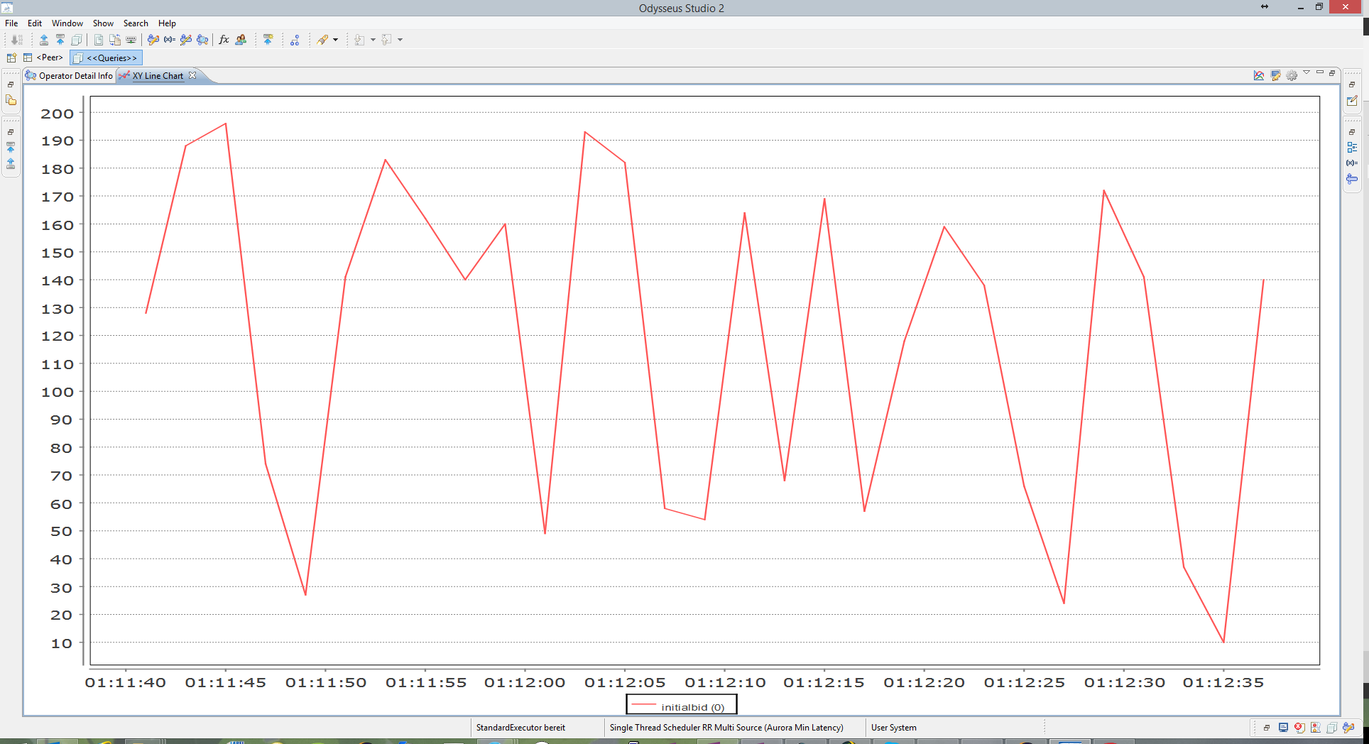
A new windows is opened (and if the query is running is filled with input). The following example is from nexmark:auction.

As you can see, all numeric values are per default selected in the graph, which is not very helpful in this scenario.
To select a subset of attributes select the button in the upper right area of the window:

And the following window appears:

On the left side you see all attributes that are available for selection and on the right side visible and groupBy marker. Visible means, that this attribute is show in the diagramm. So to show how the initial bids of auction behave, select button "Deselect all" and choose the attribute nexmark:auction.initialbid(0). (Ignore the (0) in this case). After pressing OK, the diagramm will be created new with only one value.
Remark: It could be necessary to adjust some things to show the chars. For this, use the button right from the attribute selection button.
Depending on the diagram you choosed, different options are available:
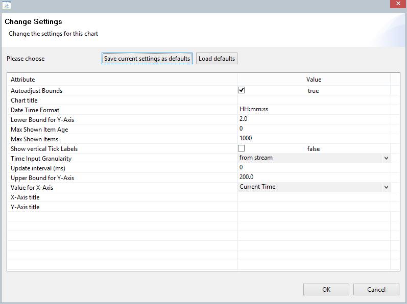
- Autoadjust Bounds: The diagram will adjust the x and y axis to the existing values.
- Chart title: A title can be given to this chart
- If data is visualised (typically in the x-axis) here you can state how it should be presented
- Lower-Bound of Y-Axis: What is the minimal value on this axis
- Upper-Bound of Y-Axis: What is the maximal value on this asis
- Max Show Item Age: Here you can define, how old the oldest element in the graph should be, 0 means no restriction on time. The unit for this is given by Time Input Granularity.
- Max Shown Items: How many measurements should be shown in the windows, 0 means, show all.
- Show vertical Tick Labels:
- Time Input Granularity: What is the unit, the time data is given. Typically, this is read from the stream (in most cases milliseconds), but can be switched to different other formats.
- Update Interval: Time in ms how often the graph should be printed new. Default 0 means: Print after every new element.
- Values of X-Axis: What attribute should be shown on the X-Axis. Typically, this is the time.
- X/Y-Axis title: Name the axis.
Remark: After changing a value, the diagram will always be created new, so no older values can be seen.
This way is preferred when just want to look at some values in a chart. When you always want to see the result of a query, you should try the Dashboard Feature (see Using the Dashboard Feature).