-
Created by
 user-12fa0, last updated on Mar 07, 2018
3 minute read
user-12fa0, last updated on Mar 07, 2018
3 minute read
Background
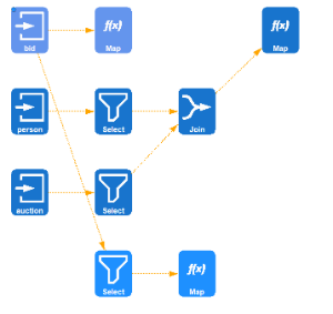
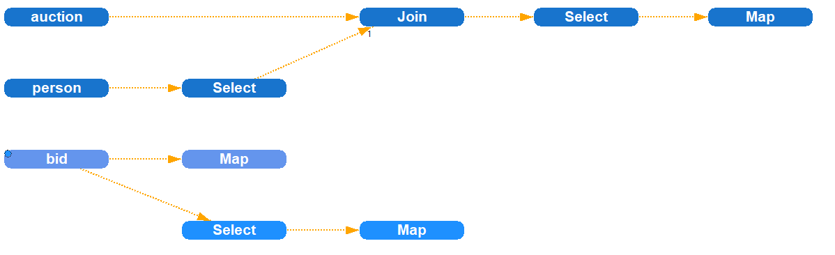
The visualization of the opertor graph in Odysseus Studio can be customized in order to change its style and appearance. The following pictures show some examples of different visualization styles provided by Odysseus.

The visualization framework provides several ways to control the appearance of the visualization which are described in the following sections.
Viewer configuration files
The way the nodes are drawn is defined in a special configuration file, the viewer configuration. It is an XML file that describes how to compose a node from different symbol elements. The schema of the file is defined in the SymbolSchema.xsd file. The following code snippet shows an example configuration file:
The Symbols element contains a list of definitions for node layouts. You can specifiy the layout individually for each type of physical operator by setting the nodeName attribute of the Symbol element to the respective class name. For each Symbol, you must specify its size and one ore more SymbolElement elements which describe the visual components to compose the node visualization. Some of these SymbolElement elements can additionally be configured using parameters that are specified as simple key value pairs. The following table gives you an overview of the available types of SymbolElement and the parameters they support.
| Type | Description | Supported parameters |
|---|---|---|
| fillCircle | Circle shape with filling |
|
| circle | Circle shape without filling |
|
| fillRectangle | Rectangle shape with filling |
|
| rectangle | Rectangle shaoe without filling |
|
| selector | ||
| image | Image |
|
| operator | Shows a specific image for the physical operator from the given icon set |
|
| invisible | Invisible (for layouting only) | |
| selectivity | ||
| text | Shows the name of the operator |
|
| ownerText | Shows the name of the operator |
|
| ownerRectangle | draws a filled rectangle. The filling color is automatically determined to indicate the script/query the oeprator was created from |
The following table gives an overview of the parameters:
| Parameter name | Possible values | Description |
|---|---|---|
| r, g, b | Integer (0...255) | RGB Color parameters. Important: Each color component must be individually specified as a single Parameter element! |
| marginLeft | Integer (0...100) | left margin (relative in percent!) |
| marginRight | Integer (0...100) | right margin (relative in percent!) |
| marginTop | Integer (0...100) | top margin (relative in percent!) |
| marginBottom | Integer (0...100) | bottom margin (relative in percent!) |
| offsetX | Integer (0...100) | Relative offset of X position (starting from left) in percent |
| offsetY | Integer (0...100) | Relative offset of Y position (starting from top) in percent |
| resource | String | ImageID of the image to show. The image ID must be registered in the ImageManager. |
| iconSetName | String | Name of the image set that should be used to automatically retrieve a matching image for the underlying physical operator. By default Odysseus provides the following image sets: white, black, and default. It is also possible to use external image sets stored in the Odysseus home directoy. |
Besides the definitions for individual physical operators, the viewer configuration must specify the Default element which is applied to all operators that are not individually styled by a Symbol element. The structure of the Default element is similiar to the structure of the Symbol element.
How to use your own viewer configuration
In order to use your own viewer configuration, you need to perform the following steps:
- Create an viewer configuration file as describhed above and store it in the Odysseus home directory.
- Open the
odysseusRCP.conffile and set the path of your viewer configuration file for theviewer.configkey. Note: The path must be relative to the Odysseus home directory. - Changes will apply after a restart of Odysseus Studio.